Tuesday, March 26, 2013

A Week With Li-Qua-Che 2.0

Li-Qua-Che, Brad Ford Smith
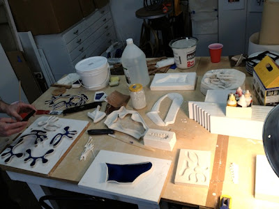
This post continues with our week long experiments with Li-Qua-Che. The photo above shows design model #2. The cork sub-straight has been gessoed and oil clay has been added to smooth out and build up the surface.

Li-Qua-Che, Brad Ford Smith
This is the plaster mold pulled from the above model. It has cured in the oven over night. The mold measures about 12" square.

Li-Qua-Che, Brad Ford Smith

And here is the finished Li-Qua-Che casting. The Li-Qua-Che picks up every detail including scratches and finger prints. So make you model as smooth as possible, and then smooth the walls of the plaster mold as well.

There was some difficulty getting the casting out of the mold, but with the help of a small pallet knife, it finally came free. The real issue was that while the casting was sitting on the table curing, it began to sag and warp.

Summing up our experiments so far, this material is surprisingly strong, but it has size limitations. It will not hold its shape if casting a single sided tile over 10" in size. With that in mind we'll move onto designing two more projects; a smaller 8" tile, and an object that is similar in proportion to a doll head.

Here's a link to some more Li-Qua-Che tips at Konittajo's Playhouse.

Friday, March 22, 2013

A Week With Li-Qua-Che 1.0

Li-Qua-Che, Brad Ford Smith
My good friend and fellow artist Kent Peaslee came down from Chicago to spend a week with me playing with Li-Qua-Che. It was like creating our own artists residency.

What is Li-Qua-Che? Basically it's a liquid paper mache that has been refined to the point that it looks more like porcelain slip. It's designed to make slip castings of things like doll heads.

During our week of investigation, we played with a lot of casting techniques, learning a lot and pushing the product to its limits. Over the next four BFS blog posts I'll be reviewing projects that focus on casting a tile from a one piece mold.

Li-Qua-Che, Brad Ford Smith
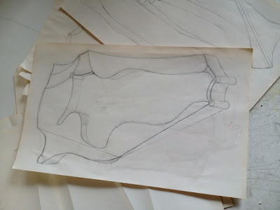
Our first project was to create an 8"x11" sculptural tile that incorporates an open space in the center of the tile. Above is the original design drawing.

Li-Qua-Che, Brad Ford Smith
In this photo we are building the sub-straight for the tile using sheets of cork. We then covered the cork with oil clay and added some details. 

Li-Qua-Che, Brad Ford Smith
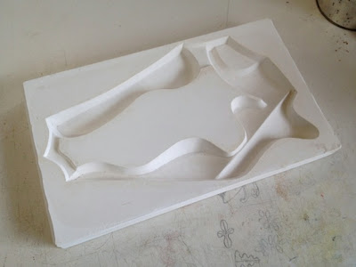
This is the plaster mold we pulled from the model. The mold was placed in a warm oven to speed the evaporation of the water from the plaster. Be careful doing this as the plaster will go through thermal shock if it gets too hot too quickly or cools down too fast.

Li-Qua-Che, Brad Ford Smith
Now for some casting. Here the Li-Qua-Che has been poured into the mold. After waiting 8 minutes it was poured out of the mold. What remains is a 1/8" thick wall of Li-Qua-Che (The gray stuff).

Li-Qua-Che, Brad Ford Smith
The Li-Qua-Che shrinks 4-7% as it dries. Just like slip casting with ceramic slip, it pulls away from the walls releasing itself. In theory, as long as there are not undercuts, the casting, after 30-60 minutes should just drop out of the mold. Unfortunately our design with the big open space in the middle of the tile created a large solid form that the Li-Qua-Che locked onto as it shrank. Getting it out of the mold caused cracks in the casting. After curing, the casting simply fell apart at the weakest structural points.


Friday, March 15, 2013

The Digitally Drunk In NYC


As I walked the streets of NYC back to the 80s, watching the young hipsters intoxicated on Jagermeister and cocaine, stumbling like helpless puppets into the on coming traffic, I was not surprised to find the late night streets of SoHo speckled with blood and teeth.

Today, texting is the preferred drug. In my latest visit to NYC, I saw people walking purposefully from point A to point B, never looking up from the palms of their hands. Its like watching some new religious cult who beleieve the world contained in the palms of their hands will protect them from the throbbing masses, bike messangers, and feed up taxi drivers.


They are the digitally drunk. Obsessed with being in touch, on top, and so with it NOW that NOW is to late.


These photos are dedicated to them. Look up people. See the drama above your heads.

...And look both ways before crossing the street.


Sunday, February 17, 2013

Secret Tales About Anonymous Portraits


The Portrait Secrets Salon is the creation of Amy Walton. She has combined two of her favorite things, collecting anonymous portraits and story telling, thus creating an entertaining literary event that is packed with home spun culture.

She began collecting portraits years ago, finding them at flea markets, thrift stores and under random rocks. These anonymous paintings, drawings and photographs cover the walls of her living room and a few random strangers now adorning in her bedroom.

When asked about the portraits, Amy would reply "I don't know who they are, I simply like them".  Over time this response left Amy feeling flat. It didn't convey the playfulness and affection that she felt for her collection. So she decided to recruit a few friends flesh out her collection by asking them to write short histories about some of her portrait pals.


For her second gathering of the Portrait Secrets Salon, I was one of seven people who had the pleasure of giving voice to one of the canvas personalities. I recounted the story of Susan and the Plumbers Dilemma. A coming of age story with drama, passion, and trouble with the pipes. It surprised me how much fun it was to write this little narrative, to dabble in the romance genre just for a bit, and to create something that was simply fun.

Check out the Secret Lives Of Our Portraits website where showcasing some of the portraits and their stories. 

Friday, January 4, 2013

First Museum Visit of 2013

Started 2013 by going to the Amon Carter Museum to see the wonderful survey of American paintings from Phillips Collection, To See As Artists See. This exhibit has multiple paintings by artists like Arthur Dove, Marsden Hartley, Charles Sheeler, plus a several artists I was not familiar with.


Included are some of the best Stuart Davis paintings I ever seen in person, my fav being Blue Cafe'. The simplicity of the image is built upon a complex composition, sensitive color relationships and masterful paint handling. You have to see this painting in person. When you do, you will fall in love.

I must admit that I have been to Washington DC a few times but have never made it to the Phillips Collection, a mistake I will fix next visit.


Monday, December 10, 2012

Wednesday, November 7, 2012

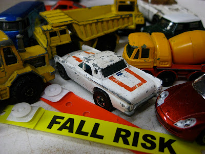
Fall Risk

There is nothing quite like having a "Young Person" give up their set in a waiting room and address you as Sir. That is until the nurse straps a big yellow band across your wrist that states in all capital letters FALL RISK. What a day. Think I'll go back home and curl up with a big glass of prune juice.